TL;DR
- Color precision is when your screens match.
- You PROBABLY don’t need perfect color accuracy.
- Calibration is confusing and here’s how to do it.
- Color management is messy and it sucks.
What is Color Precision?
Before talking about color precision, it’s important that we make a distinction between precision and accuracy. Precision is all about getting consistent results, while accuracy is about getting correct results. Precision and accuracy work well hand in hand, but aren’t mutually correlated. For the sake of this guide, we will be prioritizing precision over accuracy.

Here’s a basic diagram that helps visually describe the difference between precision and accuracy. Image attribution
Color accuracy is when the colors on all your monitors are as close to “perceptually correct” as possible. Accuracy doesn’t necessarily mean that the colors on each monitor will match each other. If you’re using different monitors with different color accuracy, the colors on each monitor will show up differently, despite each monitor attempting to display colors as accurately as possible.
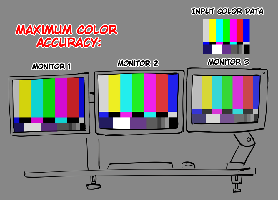
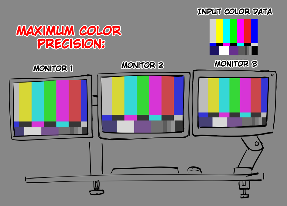
Color precision is when colors on all of your monitors are matching each other as close as possible. This does not typically require very expensive monitors, however, you will always be limited by the least color capable monitor in your setup.
So Which One Do You Want?
In a perfect world, with the perfect professional setup, with perfectly color managed software, you could achieve precise and accurate outputs that exactly match the input color data. In the real world, this is especially tempting for professional photographers and video editors who work very hard to make sure the colors that they’re working with are accurate and exactly how they should appear in the most ideal scenarios; however, for 99 percent of people and digital artists, you may want to maximize color precision at the expense of color accuracy.
There’s nothing quite as frustrating as finishing a drawing you produced tirelessly on one screen, and then dragging it over into another monitor to find out that the colors are completely different. Believe me. I’ve probably wasted at least a hundred cumulative hours attempting to get the colors of my illustrations to look right on all 3 of my monitors. This is why color precision is so important.
Chapter 0: Is This Worth the Investment?
If color precision has never bothered you, I welcome you to click off this guide and continue to live in blissful ignorance. Trust me, it is far better to not care if you don’t already care; however, if you are cursed with the knowledge that your colors do not match, welcome to the club.
It is technically possible to achieve color precision for free through a very headache inducing process; however, I recommend renting or buying some sort of colorimeter that works with DisplayCAL. I use a Spyder X Pro; though, there are potentially better options out there.
I had trouble getting DisplayCAL working with my Spyder X Pro due to Argyll 2.3.1 not functioning properly with that device. If you have a Spyder X Pro or intend on getting one, you may need to use Argyll 2.3.0 instead.
Chapter 1: White Points
The white point of your monitor is one of the most crucial things to get right when attempting to match the colors on all of your monitors. The white point is essentially the deciding factor for how the color temperature and tint your colors are. Do your grays feel too warm? Too cold? Too purple? Too green? How your white point is set will ultimately decide how the resulting color will look to your eyes.
Important
White points are perceptually different based on the lighting of your environment. Ideally, you will want to match the white point of your monitor to the lighting of your room.
The color temperature of light is measured in Kelvin, based on the temperature and light output of black-body radiation. All you really need to know is the higher the temperature in kelvin, the cooler the color of light gets, which can be a little counter-intuitive.

A lot of sources tend to disagree on what classifies as “daylight,” “soft white,” or “neutral” light. The important thing is to pay attention to the color temperature in Kelvin.
If you use 5000K daylight bulbs in your room, you might want to set your white point to the 6500K photography standard.
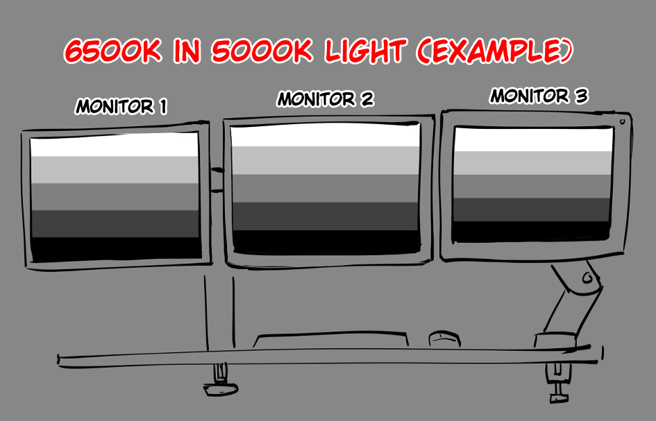
Example of how 6500K light is perceived under daylight bulbs. The grays are perfectly neutral with the environment.
If your room uses a warmer light bulbs, 6500K may end up looking too cold, and it may help to set your white point to something warmer such as the 5000K graphic arts industry standard.

Example of how 6500K light is perceived under soft light bulbs. The grays are too cool and leans toward cyan and blue.

Example of how 5000K light is perceived under soft light bulbs. The grays are adjusted to the environment and are perceptually neutral again.
Chapter 2: Brightness / White Level
Another big part of color precision is maintaining consistent brightness across each monitor. Not all monitors are capable of outputting the same brightness and this can cause issues where colors will not look right.
We will need to lower our brightness on the other monitors to match the monitor with the weakest peak brightness.
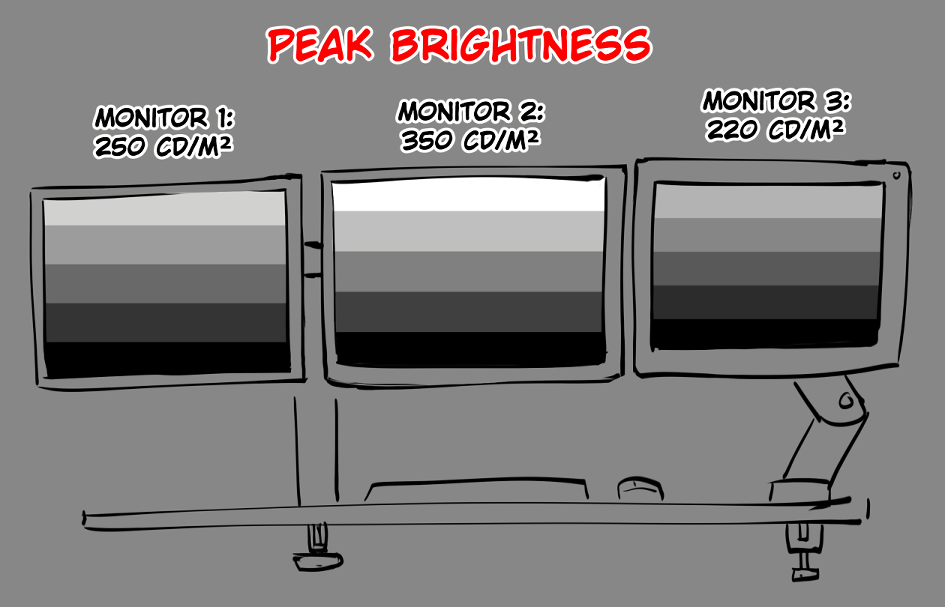
I personally find that calibrating my monitors for 190cd/m² generally grants the best results for my environment, however you will need to play around to find what brightness works best for your eyes and your environment.
Chapter 3: Calibration
Now that we understand these basic concepts, let’s talk about colorimeters.
Colorimeters are devices that are specifically designed to sense the light coming off of a monitor. They are the best solution for getting your colors as accurate as possible. Colorimeters do this by interfacing with calibration software such as DisplayCAL by sending information about the light emitted from your monitor. From there, the calibration software will generate a file called an ICC profile, which adjusts the colors outputted by the computer to the monitor.

Each monitor will need its own unique color profile to display colors as accurately as possible. Calibration can take roughly 10–20 minutes.
If you have not installed DisplayCAL, make sure to do so and any required drivers. You may need to look up how to set it up to work with your colorimeter, setup differs wildly depending on the colorimeter you use.
Getting Started
- Start off by plugging your colorimeter into your PC. Make sure it connects directly to the computer instead of a USB hub or secondary device.
- Start DisplayCAL and make sure your colorimeter is detected, and you have the correct monitor selected. You might need to experiment with which “Mode” works best for you, but don’t worry if you only have one option.
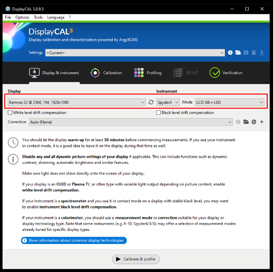
- Click on the calibration tab and set your desired settings. Always set the tone curve to
Gamma 2.2and turn onInteractive display adjustment.

- Now click
Calibrate & profileat the bottom of the window. Make sure the calibration window shows up on the correct monitor. If it does not show up, make sure to cancel and try another monitor in step 2. Sometimes monitors will just show up asGeneric PnP Monitorinstead of the actual name of the monitor.

- Click
Start measurementand follow the prompt. This window will likely show up on your main monitor. Feel free to drag it over after following the prompts on screen.
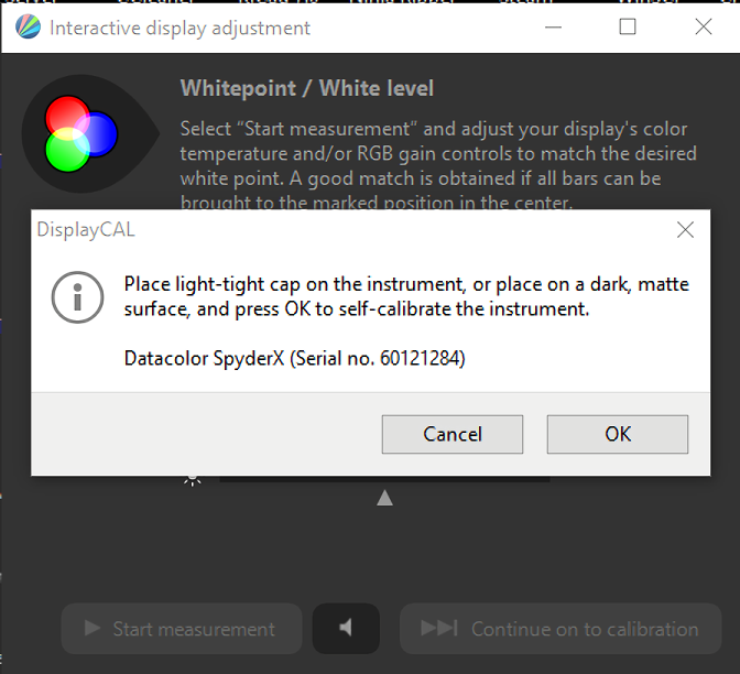
- Make sure to tilt the monitor up, so the colorimeter is flush with the screen to minimize light leak.

- Now for the most involved part of the process:
Click
Start measurementand wait for the window to start showing the white point bars. You will need to adjust your monitor’s settings to line up the colors as close to both targets as possible.

- Open your monitor’s OSD (on-screen display). You may need to go into the settings to reposition the OSD if it shows up in the middle of the screen. Navigate to the color temperature settings and use the user/custom setting. Your monitor’s OSD may show different names and settings, so make sure to familiarize yourself with the layout.
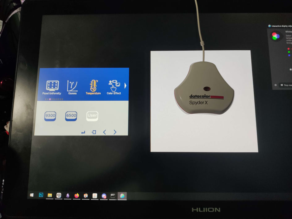
- Edit your RGB settings. You may also need to adjust your backlight or brightness setting if the brightness is too light. If your monitor already has a backlight setting, do not adjust the brightness setting.
From my experience, green tends to affect the brightness the most. What you’re attempting to do is balance the red, green, and blue bars on the calibrator until you reach the target white point. If for whatever reason, your monitor cannot meet the target white level, you may need to lower the white level in step 3.


Important
Try to keep your RGB settings near the middle value. Having RGB values too high or low can mess with the colors. If you absolutely must go further in one direction, it is better to subtract than add RGB values from the middle.
- After meeting your targets in both white point and white level, click
Stop measurementand then clickContinue on to calibration.

- The hard part is over. Now just sit back and let DisplayCAL do its magic. This will take longer than you may expect.

- After the calibration is complete, click
Intall profile. You are now finished. Repeat from step 2 for your other monitors.

Making Sure Your Profile Installed Correctly
You can double-check that your monitor profile is on by right-clicking your desktop and going to Display settings.
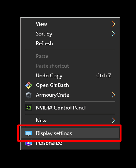
Click on the monitor you calibrated and check if the profile you made shows up in the Color profile drop down box. The profile name will also give useful information about the profile.
The name is of the profile, structured as follows:
<Monitor name> <Output number> <Year>-<Month>-<Day> <Hour>-<Minute> <White level> <White point> <Gamma curve> <Calibration speed>-<Profile quality> <Profile type>
This information will be useful for differentiating between multiple profiles in the future.

Color Checking Your Profile
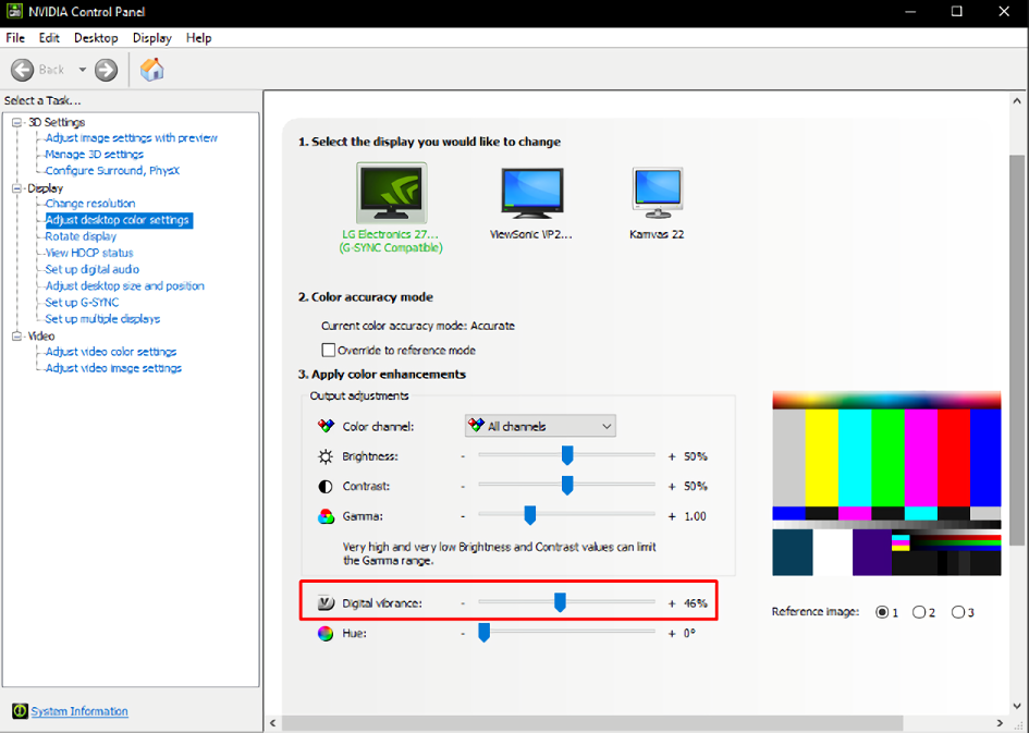
Once you’ve calibrated all your monitors, check your colors using a non-color-managed software such as MS Paint. Paste various images into the canvas and check to see if they look consistent between your monitors. If one of your monitors appear too saturated compared to the others, you can turn down the vibrance in your graphics card control panel.
Important Note
Even though you color calibrated your monitor, this will not be the last time you will need to calibrate it. Over time the color on your monitors may change, so every few months you might need to recalibrate them.
The process is much less of a headache after the first attempts since you likely wont need to fiddle with the OSD. Just recalibrate whenever the colors start bothering you. For most people, this will be a long time.
Windows updates have also been known to break things so make sure to check that you’re still using the same profile.
Chapter 4: Color-Managed Software
Now that you have color profiles installed, let’s talk about color managed software. Most software out there is not inherently color managed, and not all color managed software is managed the same. In order to achieve color precision, we need to limit the amount of color management done by color managed software. Otherwise, some software will not display colors the same as others, and it simply leads to compounding issues.
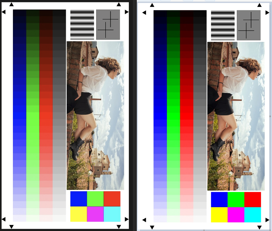
The standard color space for web content known as sRGB. Color managed software will attempt to take content such as images that are tagged for sRGB and adapt it to your monitor’s color profile. The result of this now non-color managed software will display in full vibrant color and images in color-managed software will appear washed out and desaturated.
For color precision, color management is bad.
Left is Photoshop, a color managed program. Right is MS Paint, a non-color managed program.
The Photoshop image is desaturated and washed out. If you cannot tell the difference between the bottom two images, you probably do not need to worry about color management.
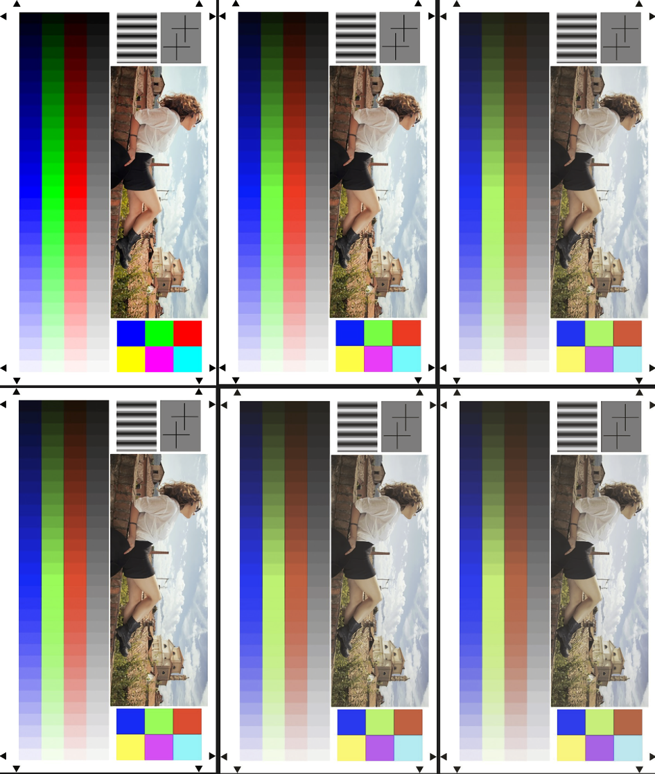
This problem can have compounding negative effects.
When taking screenshots of Photoshop and pasting the screenshot back in, Photoshop assumes the image is sRGB and adjusts how the colors are displayed each time. The result demonstrates just how detrimental color management is for color precision.
Here’s how to fix this issue on various color managed software.
Software guides
Conclusion
I decided to write all this because color has been — and continues to be — a logistical nightmare to deal with. Hopefully, this guide will help clear up any confusion you may have about how to maintain color consistency. If you have any questions or suggestions, please reach out to me!